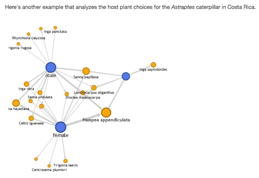
The beginning of this week, I headed to the nearby University of Massachusetts Amherst for a NERCOMP conference! I know it sounds like NERD-COMP! To be fair, we were all kind of geeking out about data and other techie stuff all day though…Anyway, during the data visualization workshop that we attended, I spent a good chunk of the exploratory “sandbox” period evaluating Google Fusion tables. What’s really cool about Google Fusion Tables is that you can take data from spreadsheet columns or CSV files, and create quick visualizations. In particular, I tackled the Network Graph feature. According to Google, “this type of visualization illuminates relationships between entities. Entities are displayed as round nodes and lines show the relationships between them.”
Biggest Pro:
– You can quickly visualize relationships between your data without staring at a spreadsheet.
Biggest Con:
– You can’t change the colors! Yellow and Blue distinguish between the different categories of information but the lack of color choices suggests that presentation is not the primary goal of Google Fusion.
I think my frustration with the limits of the Network Graph feature speaks to the greater dilemma with exploring web-based digital tools. One of the conference presenters emphasized how these “discovery tools” are great, user-friendly ways to explore and understand your data and see patterns through its visualization with minimal effort. However, the downside lies in how these readily available tools offer little opportunity for customization. At the very least, they are a platform for comparing collected data before moving on to more advanced data visualization tools. Furthermore, sometimes, if function > form, all you might want to do is make a straight-forward Network Graph that conveys the information as clearly and simply as possible. Plus, it’s fun to drag the floating nodes around like squids!