After weeks of agonizing over our final project proposal and potential research questions, the proposal itself fell together with unprecedented ease. Once we’d had a taste of thinking practically and narrowing our scope by doing individual project proposals, it seemed a natural step to integrate the elements of our own proposals that we’d found most interesting into the final project. What we have settled upon for a loose overarching question is What did Edward Hitchcock leave behind? Although, yes, it is rather broad, it’s been a useful umbrella under which we can arrange our major themes of time and legacy while still making use of the collection.
For the structure of the project, we ultimately did decide to take most of the individual proposals and connect them where relevant as sub-projects within the overall final exhibit. The idea is that we’ll have a kind of interactive website that lets viewers choose upon entering which of the ~4 sub-projects they’d like to explore first. Ideally, they’d eventually explore all of them, but we’d like to present all of the options on an equal footing, not determined chronologically or by “importance.” We want our audience to be able to engage with any part of the site and come away feeling that they’ve experienced a full narrative, not just part of one.
In terms of sites that would model something like that visually, while I can’t think of any specific examples, I feel that I’ve certainly encountered something similar before. I’m imagining a pretty simple homepage, maybe one that starts off with some basic biographical information about Hitchcock (or features that lead you through that) so there’s some kind of baseline knowledge, and then maybe leads into a page with four boxes: one for each of the mini-projects. You click on a box, and it takes you to that project page. Embarrassingly, the closest visual model I have for this is the block boxes you click on to select answers in Buzzfeed quizzes, but hey, at least those are intuitive.
I do at least have a clearer idea of what I’d like the iteration of my “mini-project” to be. I’ve harped on ad infinitum about how the Cocitation Network project in Signs@40 was in the inspiration for my mini-proposal and all that. But while it is a beautiful piece of data visualization, the kind of data that I’m looking to analyze doesn’t quite fit into the network model the same way. Signs@40 was examining the citations listed in all the articles in their journal over the past 40 years: so while the nodes of the network were from a variety of authors and time periods, they were all neatly catalogued by the single source of the journal itself. Not only does this give them a clear, demarcated set of data to examine, but it all comes back to the same point that they share in common: Signs@40.
With Hitchcock’s citations, things get a bit trickier. Hitchcock was pretty prolific and published a lot of his writings, which ranged in subject from geology and chemistry to the temperance movement. To completely measure the effect of his words, one would have to track whenever ANY of his many publications was cited: a task which not only seems very time-consuming, but kind of boring. So I plan to narrow the search to only tracking when his most important works were cited (exact criteria for that TBD). That helps a little bit with the problem of scope, but still there’s the question of having multiple sources for the citation network(s) it/themselves. Each work of Hitchcock’s would be at the center of its own network, which would necessitate a multitude of graphs, and more time. Unless, of course, we choose to put them all together in a single graph, which then raises the question of topic: should the original documents be all scientific texts, or a mix of scientific and religious? I’m more interested in looking at a medley of topics, but I’m also concerned that having too many different categories that the data points differ on could make it both difficult to model and analyze.
Data visualization of networks seems like a pretty popular field in the DH/tech community. This site has a lot of really well-constructed and easy to read data/network visualizations, so I spent some time here looking for inspiration.
My original idea of what the network would look like was similar to this LinkedIn visualization tool, which allows you to look at an aggregate of your connections on the site and see how they’re all collected to one another. Pretty much a standard network visualization. What I like best about it is the color-coding, which would come in handy if we end up doing a single Hitchcock citation graph of his top publications, as the colors could be used to designate each publication (and also offer a useful comparison between the reach of each one). What I don’t like so much about this graph is that it’s incredibly difficult to read, given all of the nodes that are included. Granted, with our project, it may not be so important to read each individual node, and more so that we at least have a visual sense of the mass of them. So actually, maybe not a problem at all.
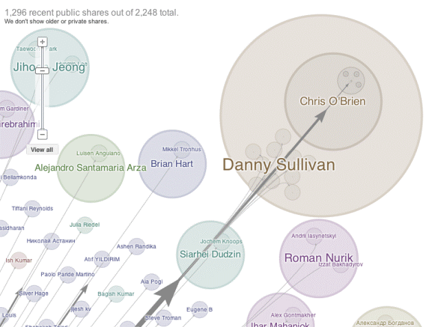
Another network visualization I looked at was this one, which charts Google+ “Ripples” that extend as a way of sharing news in social media. The idea is that when something groundbreaking or headline-worthy happens, someone/some site is the first to post it, and then some number of people will see the news and share it over social media, in this case, Google+. Then, some number of people who see that “share” will go on and share it themselves, and the news will extend out like that, reaching an even greater number of people. I found this visualization particularly interesting out of all the network analyses I saw because it seems the closest in goal to what we’re trying to see in the Hitchcock project. In mapping where Hitchcock is cited, we’re trying to get a sense of how far his influence spread, how important and worth sharing his ideas were, both back then and now. Google+ Ripples is doing something similar in that the visual effect isn’t so much focused on who did the sharing but the sharing itself, how the ripples spread out from this original source or news event. It’s all about magnitude and direction of influence, which I think will be key in creating our own visualization of Hitchcock’s influences on the scholarly world.
One potential problem with these models is that most of them are made in Gephi, or some more complicated software. While we had a brief Gephi training, none of us on the team are particularly confident or even conversational in using it, and we eventually decided that in order to not waste time, we would likely use Tableau to create the final visualization. While Tableau, as far as I’ve seen, doesn’t do anything exactly like the Gephi network, it does offer a lot more options for graphs and other visual ways to display data, and is also a lot easier to manipulate.
But before we get to that point, we have to wade through a sea of data collection and processing: all of that and more exciting things to come next week!