One of my favorite little things about this internship so far has been seeing how everyone in the group approaches our weekly blog posts so differently. Although we all are given the same prompt and have the same tools available for answering the prompt, from the beginning, each individual has made their blog post unique, distinguishing themselves with stylistic choices like bullet-pointed narrative, allusive featured images, or a first-person reflective voice. At first, I was surprised at the dramatic differences between the look and feel of all of our blog posts, but after a couple of weeks with the team, it makes sense. After we had a workshop that helped us determine our learning style preferences using the Kolb learning style inventory, it was apparent that the four of us all had very different preferred learning styles. Even where a couple of us elapsed in preferences, the determined way that we expressed those preferences was different.
The interesting thing about the Kolb inventory is that it presents the learning styles not as discrete, but all making up part of a cycle of learning that we all experience (albeit in different ways and at different paces).

So while my preferences fall in the “Assimilating” category (which prioritizes observation and thinking before any of the other steps), at some point I will have to move on to the next quadrant of thinking and doing, testing out the ideas that I’ve been conceptualizing.
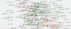
This is the point I feel as though I’ve reached in my section of the research project. I spent last week collecting a large amount of data on when five of Edward Hitchcock’s most important works have been cited, according to Google Scholar. I have a nice big Google Sheet with individualized tabs and lots of data. The question is, where do I go from here? The goal with this branch of the project is to map the network of Hitchcock’s scholarly influence after his death, but given the diversity of data I’ve collected, this could present itself in a variety of different ways. Do I map exclusively the numbers of citations and co-citations? Should frequently appearing authors or journals be connected in some way? Does that matter to us? (It might show that what appears to be a very widely spread network is just a network that is very insular, but active.) What about mapping with an emphasis on time and place? These are elements I’ve been very interested in recording from the beginning, and I think they also have some relevance with the data Seanna’s collecting, at least on a macro, if not quite micro level.
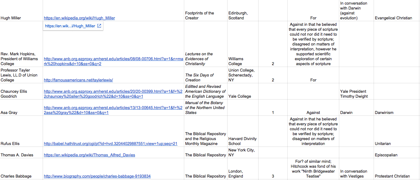
The time period of Seanna’s project is focused on the years of Hitchcock’s life, when he was actively publishing. Additionally, the data she’s been collecting comes from sources that were relatively geographically close to Hitchcock as well; the furthest source I’ve seen so far recorded is London. At first I was bothered by the lack of overlap in our data, but now looking at the scopes of our respective projects side-by-side, it seems like they’re natural continuations of one another that could easily segue back and forth. I’m envisioning two separate networks with different data focuses (foci?), but when you “zoom” in or out of one you reach the other. In the end, they’re both trying to measure Hitchcock’s relevance, influence, and effect on his intellectual peers.
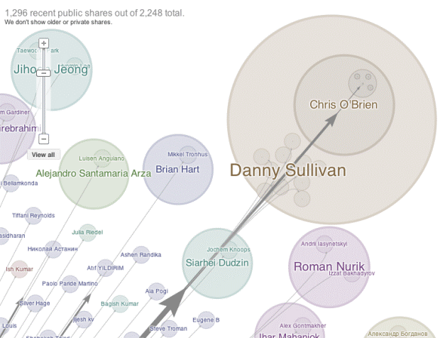
This is my dream architecture, the two networks represented visually with zooming capabilities and detailed nodes. However, this is my imagined approach, one that is very visual and very attached to the network image that’s been fascinating me from the beginning. Like with the blog post, I’m approaching this project with a preconceived set of expectations for what it should look like. When I find myself hesitating about the direction to take my visualization (and especially in what data to include), I think that one way of moving forward could be turning to the team to see how they would approach the visualization. If we had more time (always, always, if we had more time), I would love to take a day or half a day to have sandbox time with the data and Tableau. During our Tableau workshop, we played around with some of the sample data sets provided on the site, and it was fascinating to see what everyone chose, and then how they chose to visualize it with the software. I think it would be a great brainstorming experiment to give everyone my data and tell them to mess around in Tableau and present it however they thought was best. If we want to get more complicated, I could ask them to arrange the data with an emphasis on a certain category or using a certain type of visualization, to compare and contrast how they (and a potential later viewer) might be interested in looking at the data.
I’ve been trolling around the Tableau website looking at the sample visualizations they have as a substitute for the above experiment. They really showcase the variety of options you have in Tableau for displaying data, which reassures me that there’s no set template for visualizing data in a certain way. I’m hoping that through some more experimentation, ideally with the input and aid of my fellow team members, we’ll be able to find a method of visualization that best showcases the network data.

